From Static to Dynamic: The Living Menu
Cafés and restaurants kept their menus on paper, so changing a price meant reprinting everything and living with whatever was on the table until the next print run. Top Menu put the menu behind a QR code on the table, and behind that, a system that made everything work flawlessly.
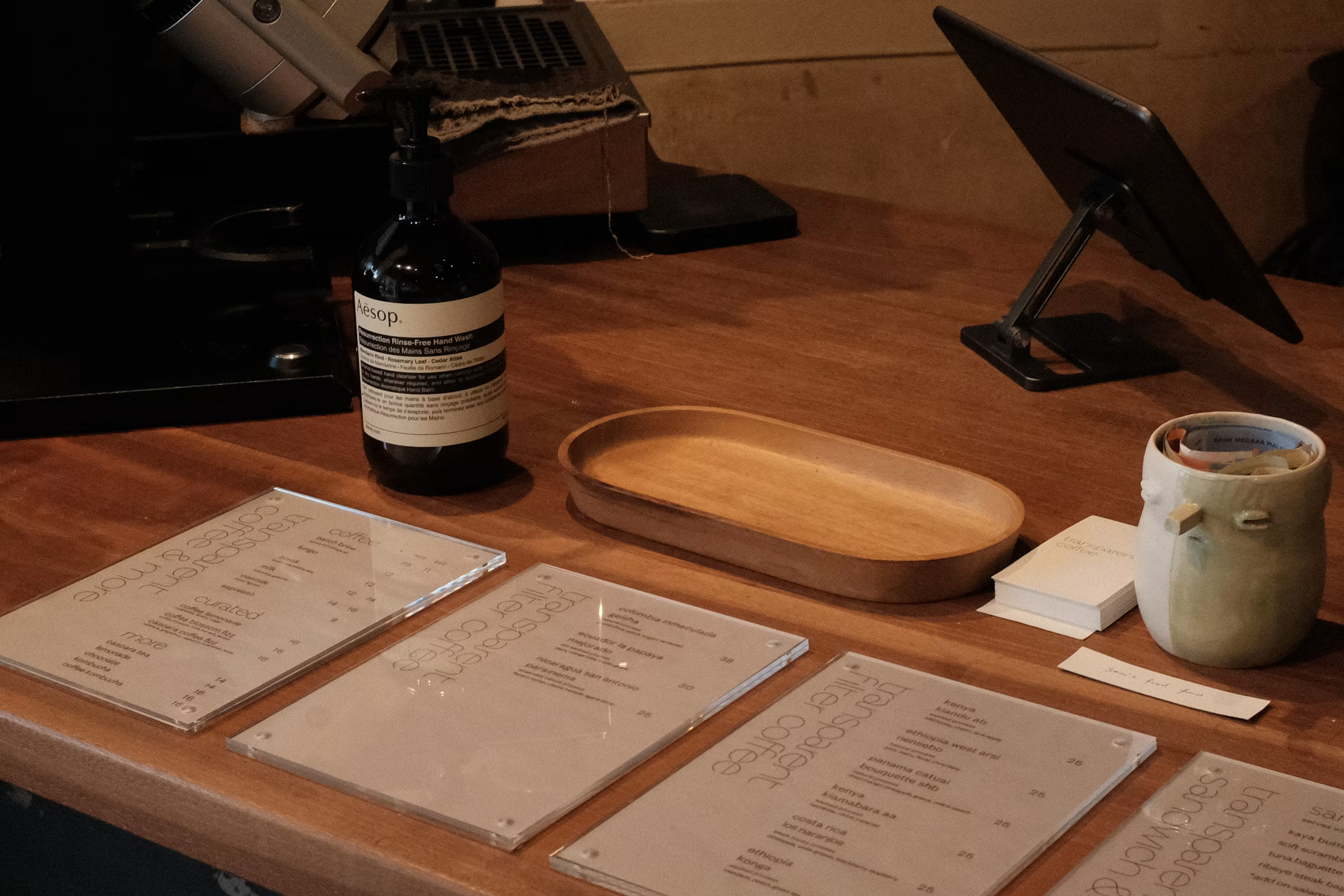 Image borrowed from unsplash.com.
What was wrong
A printed menu is fixed the moment it leaves the printer. A price rises, a supplier stops delivering, a dish sells out, and the menu on the table still says otherwise until somebody reprints the lot or goes around correcting prices by hand, which looks exactly as bad as it sounds. For a café changing things weekly that's a standing cost, a standing source of small embarrassments with customers, and a quantity of wasted paper nobody felt good about. The alternative most venues had was a PDF on a phone, which solves the printing and none of the rest.
What made it awkward
- Three audiences, one system. A customer wants a menu that opens instantly on a phone with bad signal. Staff want a till-side tool that never gets in the way at a rush. The client wanted to run hundreds of venues from above. Each would have been a reasonable product on its own.
- No two venues wanted the same thing. Some wanted online ordering and payment; some wanted the menu and nothing else, and were adamant about it. A single fixed feature set would have lost half the market either way.
- The client isn't technical, and running a platform of this size can't depend on a developer being reachable. Anything routine had to be something he could do himself.
- It was live and earning from early on. Five years of change had to land underneath a product that venues were using during service.
What I built
- A menu a customer opens by scanning the QR code on their table. No app to install, no account to make, and fast enough to be usable on a phone on café wifi.
- Ordering and payment on the same screen, so a table can order without waiting to catch someone's eye. Switched on per venue, because plenty of them didn't want it.
- A dashboard each business runs itself: menu and prices, staff accounts with access levels so a floor employee sees less than a manager, and reports on income, sales and walk-ins.
- A platform dashboard above all of it, so the client can onboard a venue, change what it is allowed to use, and see across the whole estate without opening a terminal or asking me.
- The infrastructure, deployment and monitoring underneath: the part nobody sees until the menus stop loading during a Friday dinner service.
- Documentation and mentoring for the client's own developers, so the product had more than one person who understood it.
Decisions worth explaining
The web, not a native app
Nobody installs an app to read a menu they'll look at for four minutes. A QR code that opens a page is the only version a customer will use, and it removed the app stores from the release path entirely.
The trade-off: Gave up push notifications and native payment sheets, both of which came up more than once.
Features switched on per venue, rather than one product for everyone
A restaurant taking online orders and a café that just wants its menu readable are different businesses with different fears. Letting each turn things on kept both, instead of building for the average of the two and suiting neither of them.
The trade-off: Every feature has to work with the others absent, which makes the system harder to reason about and considerably harder to test.
A platform dashboard the client operates himself
A platform where the owner needs a developer to onboard a customer has a bottleneck built into it, and the bottleneck was me. Building the boring administrative screens meant he could run the business at his own pace.
The trade-off: Months of work that produced nothing a customer would ever see, argued for on the grounds that it would stop mattering who I was.
Mentoring their developers instead of staying the only one who knew it
Five years is long enough that being irreplaceable stops being an asset to the client and becomes a risk to them. Bringing their people up on the codebase was how the engagement was supposed to end.
The trade-off: Slower delivery while it was happening, and it deliberately made me easier to replace.
How it ran
First months
The customer-facing menu and the QR flow: the piece that had to be right before anything else was worth building.
Year one
The business dashboard: menu management, staff accounts and access levels, and the first reports.
Years two and three
Ordering and payment, per-venue feature control, and the platform dashboard that took day-to-day administration off me.
Years four and five
Scale and handover. Infrastructure and reliability work as the estate grew, then documentation and mentoring so the client's developers could take it forward.
Holding up as it grew
500 venues is a different problem from 5, and most of what changed in the last two years was invisible to anyone using it.
Photos off the app server
A menu carries at least 100 photos, and every photo is its own request. Add the 20 or so requests for everything that isn't a picture, and one customer reading a menu through to an order asks the server about 120 times and pulls down about 20 MB of images. Customers read the whole menu before they order, so that's the ordinary session rather than the worst one. I moved the photos onto a separate server I set up and configured myself. That took the machine running the application from 120 requests a session to 20, which is 83% fewer, and it stopped the machine competing with itself: serving pictures and running the application had been fighting over the same processor and the same disk, and the application was losing about 40% of what it could do to that fight.
Making the photos arrive faster
Two changes on the image server, neither of which touched a line of the application. HTTP/2 first, so a browser asks for all 100 photos over one connection instead of 6 at a time in 17 waves, which took the waiting-around part of the load from about 68 milliseconds to 2. Then proper cache headers, so a phone that has seen the menu before asks "has this changed?" in about 200 bytes rather than fetching the picture again. About four photos in five now come back from the phone itself, which turns a 20 MB visit into a 4 MB one. That is the difference between a menu that makes somebody wait and one that is simply there.
Deploying without me
Releasing a change used to mean me at a keyboard for about 10 minutes, running the same steps in the same order, and nobody else could do it. The pipeline I built does it in 1 minute and doesn't care where I am. The point was never the 9 minutes. It was that a fix to a live problem stopped waiting on one person being free.
What changed
What it added up to
The paper figure is arithmetic rather than a measurement, so here it is. A venue keeps about 10 menus, each one 2 sheets, and reprints them roughly every 2 months as prices move, which comes to 120 sheets a year. Around a fifth of venues kept a printed copy going anyway, so the saving covers the other 400: near enough 48,000 sheets a year. That is a figure for one year, not a total, and it goes up every time another venue signs up. Venues are still signing up.
What I would do differently
I built the venue dashboard before the platform dashboard, which meant that for the first couple of years every new venue came through me. It felt like the right order, since it was the thing customers touch first, but it made me the bottleneck in someone else's growth and I stayed that way longer than I should have. The administrative screens were the least interesting work in the project and would have been worth doing a year earlier than I did them.
What the client said
After several disappointing experiences with other agencies, I met Hesam in another attempt to work on my idea. He designed the entire system architecture from the ground up and built a robust, scalable backend that powered all our front-end applications seamlessly. After five years of hard work, he turned my concept into the city’s #1 best-selling menu application.